
Choosing interior paint colors is about more than finding a shade that looks good on a sample card. The right color can make a room feel lighter, calmer, warmer, more spacious, or more inviting. But that same color can look completely different once it is on your walls.
Natural light, light bulbs, flooring, cabinets, countertops, and even the direction a room faces can change how a paint color appears throughout the day. That is why the best color choice is not always the first one that catches your eye.
At Tidal Touch, we help homeowners look at the entire room, narrow down the options, and compare colors in the actual space before making the final decision.
Start With How You Want the Room to Feel
Before comparing dozens of paint chips, decide what you want the room to feel like. Different color families can help establish a mood, although the exact result will depend on the shade, undertone, lighting, and surrounding finishes.
- Blues and blue-greens often feel calm, clean, and refreshing. They can work well in bedrooms, bathrooms, home offices, and coastal-inspired spaces.
- Greens can feel grounded, natural, and comfortable. Soft sage tones are subtle and relaxed, while deeper olive or forest greens add richness and character.
- Whites and light neutrals can create a bright, open, and flexible backdrop. Pay close attention to undertones because a white may lean warm, cool, gray, yellow, or pink once it is on the wall.
- Warm neutrals and earth tones, including beige, tan, terracotta, muted gold, and soft clay, often make living rooms, dining rooms, and entryways feel comfortable and welcoming.
- Pinks and blush tones can range from playful to polished. Dusty or muted pinks can feel warm and sophisticated without overwhelming the room.
- Dark colors, such as charcoal, navy, chocolate brown, or deep green, can add depth and drama. They can be especially effective in powder rooms, offices, dining rooms, built-ins, or accent areas.
- Bright colors bring energy and personality. In many homes, they work best when balanced with quieter colors or used in a focused area rather than throughout every room.
The goal is not to follow a strict color rule. It is to choose a palette that supports how you use the room and how you want it to feel every day.

Five Things to Consider Before Choosing a Paint Color
1. Natural and Artificial Light
A color may look bright in direct Gulf Coast sunlight and much deeper on a shaded wall. It can also shift after sunset under warm or cool light bulbs. Look at your options in the morning, afternoon, and evening before deciding.
2. Undertones
Two colors can look almost identical on a paint card but behave very differently in a room. A neutral may have subtle yellow, pink, green, blue, or gray undertones that become more noticeable beside tile, trim, flooring, or cabinets.
3. Existing Materials
Unless you are remodeling the entire space, the paint color needs to work with the features that are staying. Compare it against your flooring, countertops, backsplash, cabinets, furniture, and trim rather than viewing the color by itself.
4. The Room and the Rooms Around It
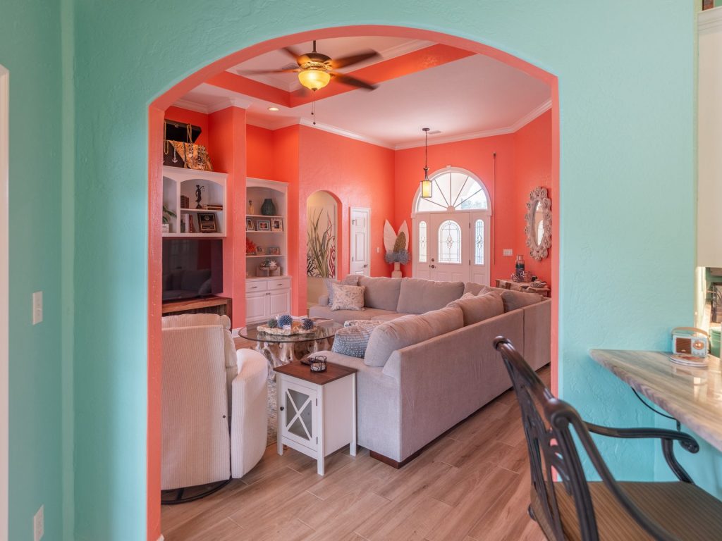
Consider the room’s purpose, size, and sightlines. Your colors do not have to match from room to room, but they should feel intentional when multiple spaces are visible at once. Repeating a shared undertone or neutral can help the home flow naturally.
5. Paint Finish
Color is only part of the decision. The paint finish affects how much light the wall reflects, how the color appears, and how easily the surface can be cleaned. Bathrooms, kitchens, trim, and high-traffic areas may need a different finish than bedrooms or ceilings.
Why You Should Test Paint Colors on the Wall
Small paint cards are useful for narrowing down a palette, but they cannot recreate the conditions inside your home. Testing the final choices on the wall gives you a much more accurate view.
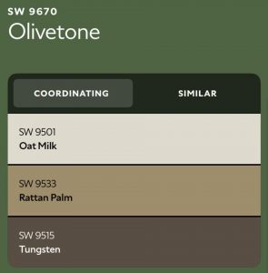
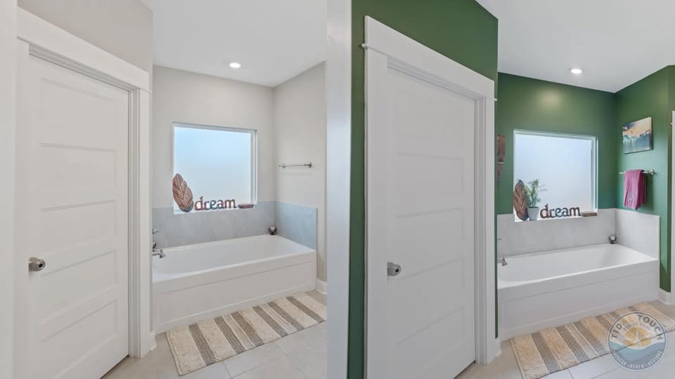
For one recent bathroom project, three slightly different green paint colors were tested side by side. Each option looked promising on its own, but seeing larger samples in the room made the differences in depth and undertone much easier to recognize. After viewing the colors in the bathroom’s actual lighting and alongside its existing finishes, the homeowner chose Olivetone.
That small test helped the homeowner feel confident before the entire room was painted.
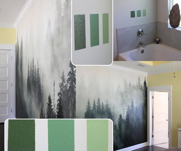
Testing three green paint colors on the wall helped this homeowner compare each shade in the bathroom’s actual lighting.
When testing colors, we recommend:
- Narrowing the choice to two to four finalists
- Painting samples large enough to evaluate clearly
- Applying the recommended number of coats for an accurate result
- Viewing each color at different times of day
- Checking the samples under the room’s normal light fixtures
- Comparing them with the trim and permanent finishes
- Leaving the samples up long enough to live with them before deciding
The selected Olivetone green gives the finished bathroom a rich, grounded look.
Do All the Paint Colors in Your Home Need to Match?
No. A whole-home color palette should feel connected, but every room does not need to use the same color.
You can create consistency by repeating one or two elements, such as:
- The same trim color
- Similar warm or cool undertones
- A shared neutral in connecting spaces
- Related shades with different levels of depth
- Accent colors that appear in furniture, art, or décor
- Complimentary or opposite color schemes work well also!
This gives each room its own personality while keeping the home from feeling visually disconnected.
Get Help Choosing the Right Color Palette for Your Home
There are thousands of interior paint colors available, but the final choice needs to work in your home, with your lighting, and alongside the materials already in the room.
Tidal Touch can help you compare options, identify potential undertone problems, test colors in the space, and choose the right finish for the surface. Once the palette is selected, our team handles the careful prep, clean application, and final details needed for a professional result.
If you are planning an interior painting project in Mobile County, Baldwin County, or Escambia County, contact Tidal Touch to request a free estimate. We proudly serve homeowners throughout Mobile, Daphne, Fairhope, Spanish Fort, Foley, Gulf Shores, Orange Beach, Pensacola, and surrounding Gulf Coast communities.
Frequently Asked Questions About Interior Paint Colors
What paint colors make a room look bigger?
Light colors can reflect more light and often make a space feel open, but they are not the only option. A consistent color across walls and trim can reduce visual breaks, and the right deeper shade can add dimension. The best choice depends on the room’s lighting, furnishings, and layout.
How many paint colors should I test?
Two to four finalists are usually enough. Testing too many similar colors can make the decision harder, while comparing a focused group makes undertones and depth easier to see.
Should I test paint on every wall?
If possible, view the color on walls that receive different amounts of light. At minimum, place a large sample where you can see it in both natural and artificial light throughout the day.
Related Posts





Tidal Touch was founded with one mission: to bring high-end service, honest communication, and lasting results to homeowners and businesses along the Gulf Coast. We’re not just painters — we’re craftsmen, community members, and service-driven professionals with a passion for excellence in every detail.
With deep local roots and decades of combined experience in leadership, operations, and public service, we treat your space like it’s our own — and we always deliver the kind of care we’d want for our own families.